Looks better, but why are you linking to the older wiki page on Tor trac? I think you should update all references to Whonix instead of TorBOX to not confuse people who don’t know about Whonix’s history.
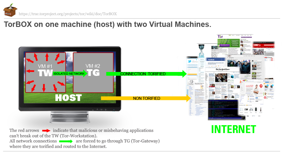
https://www.whonix.org/w/images/c/cb/TorBOX_Concept.jpg is the historic original version created for Whonix. One I haven’t tampered with. I supposed to use it as base for a better Whonix version. The newer one https://www.whonix.org/w/images/9/90/Whonix.jpg has been edited by me. Contains obvious flaws. So “I am not linking to the old TorBOX website”. The intention was to share the original an artist is supposed to use for further edits.
I like it a lot already and its ok if its like this. I have a small idea to allow users to better conceptualize the Torified connection. The middle of the arrow could be faded out and the Tor relay illustration from pg5, the ‘Anonymizer Cloud’ middle part could be inserted in there.
If you think it will overload the simplicity, nevermind.
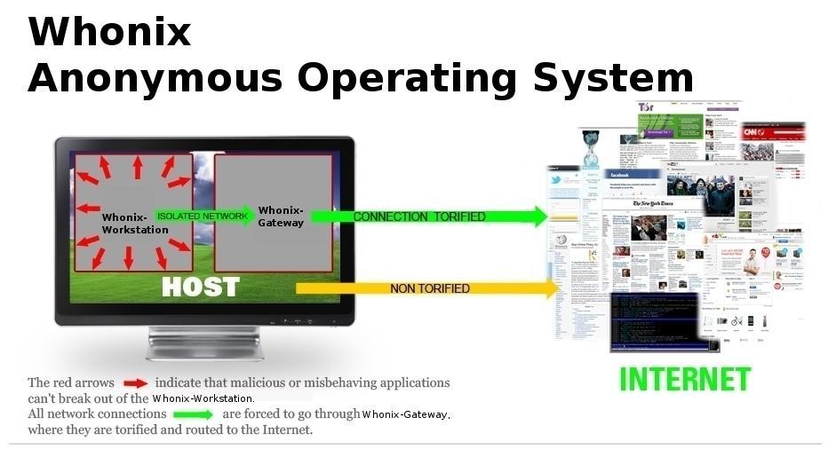
The green torified traffic channel of Whonix VMs and the red clearnet traffic channel of the Host are overlapping in the graphic.
This could cause confusion by making people conceptually think that the actual networking architecture is somehow intermingled at that point where they visually touch in your graphic.
This conceptual issue could be resolved by simply pushing your red Host clearnet traffic channel up, towards the top of the monitor, above the green Whonix torified one so that they don’t overlap or touch.
Then maybe increase the internet graphic on the right to be in balanced proportion with the arrows, assuming you do push the red one up.
[quote=“WhonixQubes, post:9, topic:531”]The green torified traffic channel of Whonix VMs and the red clearnet traffic channel of the Host are overlapping in the graphic.
This could cause confusion by making people conceptually think that the actual networking architecture is somehow intermingled at that point where they visually touch in your graphic.[/quote]
Good point.
Well spotted WhonixQubes. Understanding kills composition, but ok. It is important to be clear… red arrow is too strong in comparison with a padlock …must change that to.
This isn’t so much about layout. The whole red arrow, malicous applications can’t break out concept confuses me. At best i think a trojan can’t phone home, at the worst I think that the workstation is infected. I have a firewall that keeps infections isolated if and when I have them and its linux so it shouldn’t be infected in the first place.
So this leads me to another idea that the Whonix workstation would be a good place to develop malware. This may indeed be true but the idea made public could have an impact on trustworthiness in general and more widespread adoption. Most of my friends are suspicous of anybody looking at privacy and anonymity anyhow.
But I could see the idea of keeping a buggy program in. If you were to say something like bugged application in development, I think the general public, or at least myself, could see the whole project as good instead of suspicous. or “used by suspicous Tuggboats”
Further along these lines, some application development tools bring in some revenue streams from sources with more resources. A bigger fish so to say. It almost has to be a part of a bigger idea, with isolated entities" to engineer these types of modern revenue streams but that way outside this topic.
Suffice to say the red arrows and their captions confuse me and lead my mind to wondering.
The round, green arrow on the left is not so good because it’s going up seemingly through the host first. It’s better in the original. Also because it says: isolated network
Also we’re two times using the red color. Once for misbehaving applications and once for untorified host traffic. Not sure how, but can we do this some other way?
I believe that our critique (feedback) are all given with the biggest amounts of gratitude for your work. All further suggestions are just that. Suggestions on how to improve (the already great base)


