On the topic of quick launch icons:
Looking over the above discussion, I liked some of the suggestions above, and had some ideas to mention. Initially I thought this was going to be rather brief, but after looking at the screen for a bit I noticed a few more pain points than I expected, so this ended up somewhat long. I believe I can implement all of these changes if desirable. Note that I’m using Kicksecure here as my example, but most of this applies to Whonix as well.
System tray area
Original:
Suggested change:
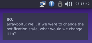
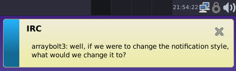
(Note that I’m using notify-send to create the notifications here.)
Desktop notifications
Right now we’re using MATE’s notification daemon. I really, really do not like it. The bright yellow sticks out very badly against the backdrop of our mostly consistent UI. xfce4-notifyd follows the system theme, omits the (rather weird looking) close button, and it’s what Qubes OS uses, so we gain a bit of UI consistency with them.
(At one point, I actually had switched Kicksecure and Whonix to using xfce4-notifyd, but we ended up reverting that change due to what appeared to be a bug in xfce’s notifyd, but turned out to be a bug in one of Kicksecure’s applications. That bug has since been fixed.)
Clock position
The clock is currently sandwiched between the system tray and the desktop switcher widget. and has zero spacing between either of them. This makes it look rather squished, and the location is also slightly different from where Windows, Linux, and macOS puts it (things which may be slightly annoying to users who are using Whonix in VirtualBox under Windows). To fix this, I suggest moving it to the far right and adding transparent spacers around it to separate it from the volume controls and the right edge of the screen. (This can be done with the “Separator” item in Xfce’s panel preferences.)
Icon theme
There was some mention of using a different icon theme above. I tried Papirus instead of the current Adwaita theme, and… I hated it. It added so much extra color to the user interface it was physically more difficult to use than it was previously. Even though the current icon theme might not look flashy, it is relatively easy to use, and I think that’s a great plus.
Icon spacing
The default icon spacing essentially cuts out any horizontal space that can be cut out without making the icons overlap. This gives a somewhat uneasy sense of crowding. The status tray plugin has a couple of options that can help make this not so bad - the icon size can be adjusted, and there is a checkbox for “square icons”, which prevents horizontal space from being eaten so badly. By enabling square icons and setting the icon size to 22 pixels, the icons end up spread out relatively evenly.
Workspaces
Right now we provide four “workspaces” (or “virtual desktops”) by default. These are cool in theory, but I’m not sure they’re used all that much in practice, except perhaps as a way of hiding one’s activity from an adversary who happens to look at your screen. Despite the fact that they are somewhat useful, I fear they may be confusing to users who aren’t used to them. This is compounded by the fact that if you have your mouse over an empty area of the desktop, or over the workspace switcher widget, and accidentally trigger a “scroll” event (such as with touchpad two-finger scrolling or by bumping your mouse’s scroll wheel), you’ll end up switching desktops. For a user who knows about this feature, this is mildly annoying, but for someone who’s just starting out with Linux, this may lead them to believe that their work has vanished because they sneezed while holding the mouse, their cat decided to lay on their desk, or something similar to that.
Furthermore, it looks like LXQt doesn’t support workspaces under Wayland. Xfce does, but Xfce has other issues with Wayland (such as inability to set the desktop background) that could interfere with that.
Application menu and desktop
Original:
Suggested change:
Application menu icon
Right now we’re using the default Whisker Menu icon, which uses a mouse head as the icon (probably because Xfce’s mascot is a mouse). Due to the icon’s location, one can guess this is the “start menu” without too much difficulty, but “mouse head” doesn’t communicate “start menu” to me immediately. What would communicate “start menu” to me is to have the distribution’s icon as the menu button (this is what it seems most distributions do). I took the existing Kicksecure icon, and rounded the corners somewhat to make a start menu icon. Something similar could probably be done with the Whonix icon without too much trouble.
Wiki access shortcut
Given how much info is in the wiki and how often we refer users to it, it may be useful to provide it on the desktop as a web shortcut. Whonix could link to the Whonix wiki here instead. This is similar to something Lubuntu does, by linking to the Lubuntu Manual using a desktop shortcut.
Misc
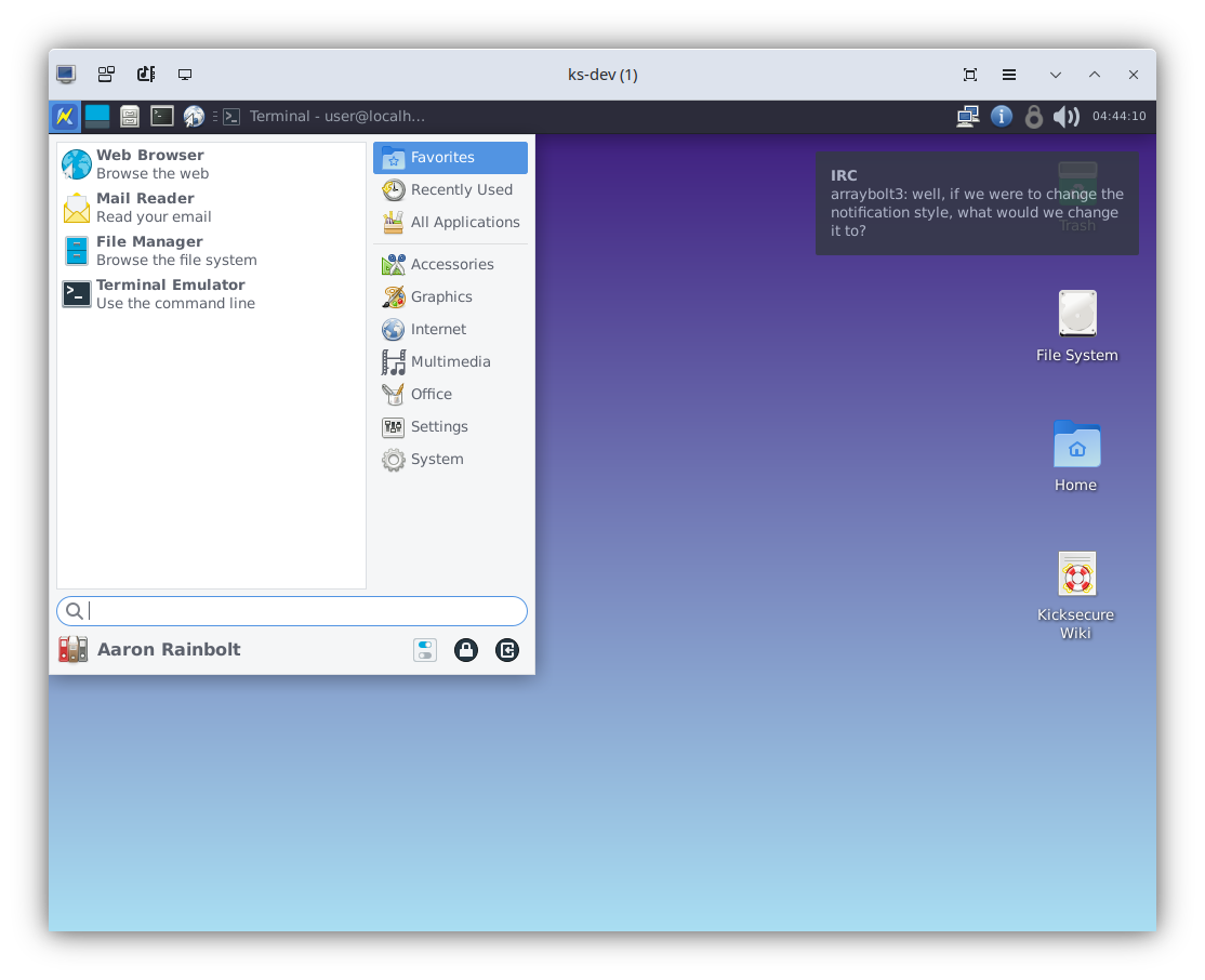
Enable changing user icon and display name
If you click on the start menu at the moment, you’ll see a rather drab bit of space with a generic icon where a user icon and name usually goes:
![]()
If you then try to click that in the hopes of changing the user icon or display name, you’ll be given this error message:
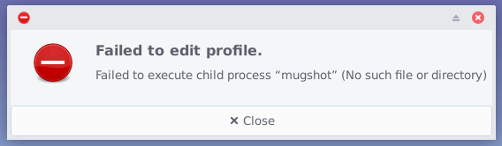
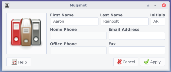
The “mugshot” utility mentioned here is written by an Xfce and Xubuntu developer, and is present in Debian’s repos. It looks like this:
And the end result looks like this:
![]()
Arguably Whonix users may not particularly want to use these features since putting your name into the OS’s configuration may make it not-so-anonymous if a VM is compromised, but at least getting rid of the somewhat confusing error message would be helpful so that users aren’t left asking “what is ‘mugshot’? Why isn’t it found? What does editing a profile mean?”
Background images
Currently, the default background for the lightdm login screen is solid black. This makes it look somewhat broken, as if an image was supposed to be there but isn’t. We could reuse the default desktop background for lightdm also.
The default background on the desktop may be somewhat problematic as well though - for Whonix-Workstation and Whonix-Gateway, it’s a rather easy-to-look-at blue or gray solid color, but on Kicksecure it’s a somewhat harsh purple-and-teal gradient. I like the solid colors Whonix uses, but am not particularly fond of Kicksecure’s default background.
The problem with the solid-color or gradient wallpapers is a bit deeper than just appearance though - on every physical machine I’ve tried Kicksecure on, the background just doesn’t show up at all and I’m shown a bluish-gray background instead, completely different from the one shown while in a sysmaint session. This will probably occur on Whonix-Host as well, once it’s developed.
It might be worthwhile to pick some sort of good background images. Even if we just use images that contain the existing desktop background (gray, blue, purple-and-teal gradient), that would at least ensure the backgrounds show up as intended. We may also want to change the background used on Kicksecure to a muted solid color of some sort, similar to Whonix.
Application style
I’m not entirely sure switching from Arc to a different application style is a good idea, but in some ways Arc is confusing with its inconsistent application of light and dark theming. Thunar gets a mixture of both at the same time, Catfish shows up fully light-themed, Inkscape shows up fully dark-themed, and there’s an icon selector in Xfce that does, well, this:
This makes me wonder if we shouldn’t either go with a purely light theme like Arc-Lighter, or a purely dark theme like Arc-Darker.
Implementation
As a cohesive whole, the theming suggestions made above end up looking something like this. I moved the icons to the other side of the screen to let them be visible at the same time as the application menu, I don’t think they actually should be moved from their normal location.
It doesn’t look much different from what we had, but the ways it does look different are hopefully helpful. All of this can be implemented using what’s already present in Debian Bookworm, and most of these changes can likely be carried over to LXQt when Whonix and Kicksecure are ported to Trixie.
It might be wise to defer the actual work of implementing this until we port to Trixie and LXQt, and just use this as a guiding concept for now.
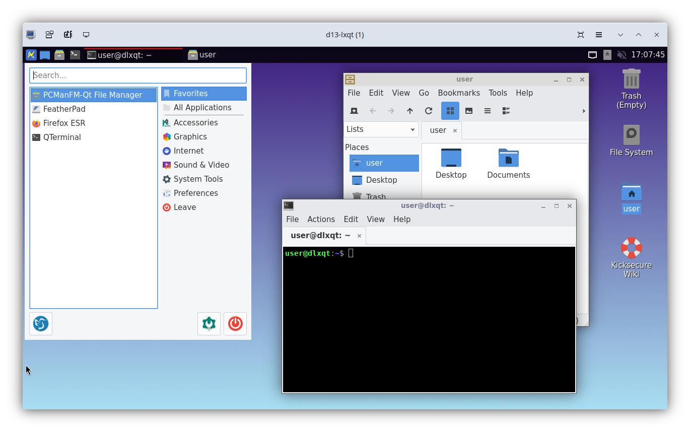
I attempted to port Kicksecure’s existing theming to Debian Trixie + LXQt + labwc, to some degree. This was a relatively “lazy” port to see if I could get something that looked reasonably similar (and that actually worked) without a monumental amount of effort. The end result, at a glance, is:
Some notes from my work (which may be relevant to Wayland porting in general):
- LXQt’s monitor configuration utility doesn’t work. It tells you to use a utility called kanshi instead. Kanshi is not a graphical application, it’s a service that is configured via a text file, which then applies a monitor configuration upon login. This is… not exactly great. There is a graphical utility called wdisplays which is in the Debian archives and which can be used to configure displays under Wayland. The settings made by wdisplays are not persistent though. There is a fork of wdisplays that can save Kanshi configuration, but this is not packaged sadly.
- Debian has, quite unfortunately, failed to package a critical component needed to get LXQt and Wayland to work together, that component being lxqt-wayland-session. Without this, LXQt does not behave well under Wayland (in particular, windows buttons do not appear in the task bar, and display managers are unable to start LXQt with Wayland due to a missing desktop file). It is possible to compile this from source and install it on Debian Trixie, and once installed, LXQt behaves itself much better. If we port to LXQt, we will have to package this ourselves.
- The default icon theme is Papirus, which has some poorly-colored icons (i.e. you end up with light icons on a light background). Switching the theme to Papirus-Light fixes this
- There doesn’t appear to be a window manager theme that is a reasonable analog of the one we’re currently using. The theme displayed here is a customization of the “Bear2” Openbox theme, with the colors changed to match those from Kicksecure. There are still obviously many differences between the themes, but they still at least look passable. I could probably get the theme to look a lot more similar with some effort, but again, this was a low-effort port attempt. I’ll probably try to polish this more once we’re doing actual porting work, if we choose to switch to LXQt.
- By default, if you move the panel to the top of the screen, it will overlap the desktop icons by a significant margin. Setting the top work area margin of the desktop to 36 pixels resolved this.
- The context menu theming isn’t consistent yet. Right-clicking on the panel will give you a totally different context menu style than right clicking on the desktop or in apps. This is probably because the panel context menu style is dictated by the LXQt style, not the application style.
- The GNOME NetworkManager applet is still being used, rather than the Qt-based nm-tray applet. This is because nm-tray seems to not be Wayland-ready - the popup menu it creates ends up showing up as its own window, which pops up in the middle of the screen. The GNOME applet doesn’t respond to left clicks anymore, but it does respond to right clicks, and provides a decent user experience when using the right-click menu. There might be a better network management applet to use, but so far this is the best we have.
- labwc seems to have serious problems with QEMU/KVM’s graphics emulation options. With virtio graphics, blocky graphical corruption occurs during web browsing, pointer movement, etc. With QXL graphics, the graphics are much more stable (not perfect but decent), but Firefox will intermittently hang all VM graphics for multiple seconds, leading one to potentially believe the VM has crashed (and of course preventing any desktop use of the VM in the mean time). This is a wlroots problem (or perhaps a kernel problem?) that appears to have received no response from upstream, almost any compositor in Debian we choose will likely have identical issues. Might be better to look into other virtual graphics hardware options.
- There is an option in pcmanfm-qt for picking a solid-color background. Gradients don’t seem to be supported. The background shown here is a PNG image made with GIMP.
New development…
Xfce → we moved to → LXQt:
LXQt - Wayland support
A request to change that:
Project specific start menu icons is implemented in version 18.
Was implemented as part of Change default shell from bash to zsh by default?.