I tried to set a homepage at Preferences -> General. the setting is saved but the browser keeps displaying the Whonix start page instead, ignoring my setting.
I guess I can edit the /usr/share/homepage/whonix-welcome-page/whonix.html file itself but looking in /usr/bin/torbroswer it seems as if the homepage set by the user is supposed to work.
running printenv, I don’t see $TB_CUSTOM_HOMEPAGE as an environment variable.
I’m not sure which came first? @Patrick
$TB_CUSTOM_HOMEPAGE or $TOR_DEFAULT_HOMEPAGE?
Maybe TB_CUSTOM_HOMEPAGE (/usr/bin/torbrowser) was a workaround until Tor Browser added native support for TOR_DEFAULT_HOMEPAGE? Also, whichever one can be sourced from ~/ would be preferable.
I’m not sure which came first? @Patrick
$TB_CUSTOM_HOMEPAGE or $TOR_DEFAULT_HOMEPAGE?
I am not sure of the timeline.
Perhaps:
TB_CUSTOM_HOMEPAGE a /usr/bin/torbrowser feature. Ignored when
starting Tor Browser directly through /home/user/.tb/tor-browser/Browser/start-tor-browser.
TOR_DEFAULT_HOMEPAGE a TorButton feature. In theory better than /home/user/.tb/tor-browser/Browser/start-tor-browser but in practice
there could be a bug in TorButton.
One could investigate using git history and whatnot.
Maybe TB_CUSTOM_HOMEPAGE (/usr/bin/torbrowser) was a workaround until Tor Browser added native support for TOR_DEFAULT_HOMEPAGE? Also, whichever one can be sourced from ~/ would be preferable.
TOR_DEFAULT_HOMEPAGE=about:blank torbrowser doesn’t work for me.
TOR_DEFAULT_HOMEPAGE=about:blank /home/user/.tb/tor-browser/Browser/start-tor-browser also doesn’t work
for me. So it’s not a /usr/bin/torbrowser bug.
There could be a non-Whonix specific TorButton bug: “If Tor Browser
prevously started when TOR_DEFAULT_HOMEPAGE was set and later changed,
on next Tor Browser start TOR_DEFAULT_HOMEPAGE is not adhered”. Anyone
up to investigate outside of Whonix and possibly report to Tor Project?
Setting the environment variable TOR_DEFAULT_HOMEPAGE to a custom
value. This would have a similar effect as setting environment variables
as outlined in Tor Browser Transparent Proxying.
it works. it gives the confirmation popup. anyway to get rid of that? it doesn’t show with Whonix start page, and my homepage is a local file as well. no javascript plain html perfectly safe
when I click “New Identity” the browser opens the page in the settings
it can be very helpful i don’t want to use the bookmarks toolbar because of fingerprinting
Whonix is getting quite polished these days code-wise, better security, more functionality and so on. But being greeted with a mid-90s mockup on every Tor Browser (re-)start detracts from the final product image IMHO. This is particularly true since Tor Browser is at the heart of the platform.
If I recall correctly there used to be a sexy, sleek Whonix welcome page a couple of years ago, but some Tor Browser change (?) broke the appearance, hence the flashback to the old school presentation. I don’t know about you, but every time it opens I feel like I’m back using Win 3.1 & Netscape Navigator is all the rage again
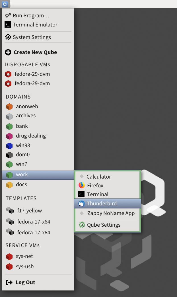
A rough analogy of the difference a good visual presentation makes is Qubes (yes, I know the example below is the broader desktop, but it has paralells).
Look at what the current (average) icons, menu presentation etc. is going to be transformed into here →
And compare that to the current Qubes look. It goes from average to great, leaving the user with a sense of ‘more polished’, ‘they know what they’re doing’ etc.
I’m sure any survey here would strongly recommend a sleek change. If we can’t restore the old version, maybe one of the arty crowd would design something sexy and modern.
I also wonder about the white to green fade colour selection. Something more vibrant might work better also e.g. darker blue or something with a high res image of the whonix logo. (The designer crowd would know what works best from general design principles.) That font selection isn’t great either visually; there must be more modern open source options available.
While we’re at it, the “Whonix is experimental software. Do no rely on it for strong anonymity.” line should be reviewed at some stage. Is 7 going on 8 years later really still ‘experimental’?
Relying on TBB straight off the host is actually bad for ‘strong anonymity’, so I think that line underplays the strengths of the Whonix foundational design, particularly since you’ve had the input of a lot of strong devs over the years like Marek and co.