Good day,
While I very much like the draft you’ve uploaded, I have to say that I maybe miscommunicated what I meant when I wrote about having a “Quick-Start-Guide”.
Obviously, a “normal” QSG is supposed to contain every information necessary to initially get a program/thing/whatever to work properly, not more and not less. This kind of information could easily be communicated on just one page, potentially even while staying under 500 words, making it easily digestible.
However and you are free to correct me here, I feel like something like Whonix needs more than just “how to run it” so a user is properly informed. After all, we are talking about software, which even people skilled in technology and with an extended background in Linux, sometimes don’t understand completely. If you look at my current draft, you may see (under “Chapters”) what I personally consider to be the topics any newcomer to Whonix should have a rudimentary knowledge of. “What is Tor, how do I verify images and which software can I use with Whonix?”, should be addressed in small, bite sized junks (maybe under 500 words and with only three sub-chapters?). A FAQ could serve this purpose obviously, though it would thus be quite long, which in some cases might lead to users not reading it at all and in others, might confuse/frighten them. Both states we should probably try to avoid. Having these topics split in small, bite sized junks will make them automatically appear less complex.
That a long FAQ, even when perfectly written, can be problematic can best be seen with “TheTorProject” itself. Their FAQ (How can we help? | Tor Project | Support) answers most questions anyone can have, yet these questions are still asked (even on here), because people don’t like reading such long text, even when looking for specific information.
Now, you’ve said, a side-bar might be useful in the FAQ, though I would say that if we go “this route”, which would be fine by me, some way of quickly navigating to any point in it will be necessary. It mustn’t be a bar, though something needs to be there as, like I’ve suggested before, it would probably be rather long. The Elementary method works, because their pages are short, our FAQ, even when updated, will very likely be a bit longer.
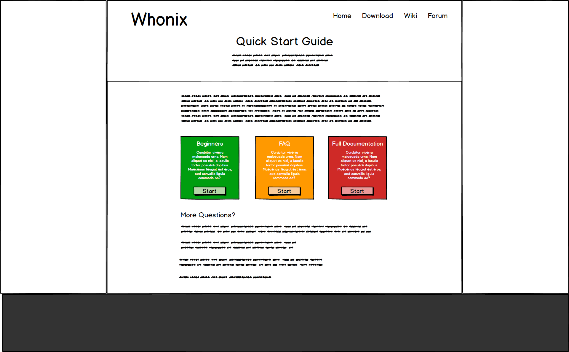
So, here is what I’d suggest and you are free to critize it if you think it isn’t a good idea: The “Quick-Start-Guide” or whatever it will be called in the end, should employ a front page similar to what your sketch shows. To some extend it would look like the “Download-page”, currently found here: Whonix Now, on the left we have, as you suggested, a guide for people who just want to set-up Whonix via any way they like. It should be short, mention “Verification” and point to additional info. Nothing more though. Now the middle button though, instead of leading to a normal FAQ, which has “all the info” on one page, could be a step-by-step based approach, similar to what I initially proposed.
The advantage would be that people would be less overwhelmed with information at once.
The disadvantage? We still have the navigation problem. Placing the chapters over the text on mobile would force users to have to scroll furiously until they get to the text they want. Having it below would lead to people searching a long time before finding it. Having non at all would give us indirect control over their learning process, though finding what you want will be a chore. Using a drop down menu, like I suggested before, would work, though it wouldn’t look that good. Having a hamburger-menu is also not possible, as it again, forces people to search and as this menu would only be used for this one section of the website, would throw of users again. And, like I’ve said before, having everything on one site would force mobile users to scroll like crazy, make the whole thing seem more complex than it is and leaves the question for where to place navigation unanswered yet again. Quite the predicament to be honest.
One possible solution, if we settle on the “single page” FAQ, would be to do something similar to this: http://yanderesimulator.com/about/ Especially the fact that the search bar serves both to search, as well as a drop-down menu (when you click on it) and the fact that it autocompletes are aspects I like. However, as so many other nice things, this approach is based on JavaScript. Whether this is recreatable for me is thus the main question.
Either way, finding a way to navigate a long FAQ or this “split FAQ” is a necessity.
Now, to get back to my proposal, making the right hand button for an extended documentation is a neat and elegant solution to a problem/quandary I had, about how to link to the “long/proper” documentation. I wanted to simply have to buttons, one for the “Quick-Start-Guide”, one for the “proper documentation” in the top bar, but your solution is much cleaner and more efficient in that regard.
Now, regarding the question whether we will need a side-bar in the full documentation, that fully depends on whether we’ll continue using Mediawiki or going for an alternative. The Jekyll based drafts I had created all employ side-bars after all… For that reason, I’m still working on getting Dokuwiki to work as a Jekyll-sub-page. It’s playing a bit coy in that regard. Which is a shame, as customizing and translating it works like a charm and it doesn’t employ side-bars in the standard configuration.