Looks great! (was gonna suggest green to go along with Whonix’s eco-friendly german roots). At the risk of being more pretentious, you could throw in a couple quotes…
2 Likes
Good day,
Will do, need to change a few CSS settings first though so the whole site scales properly on all browsers and Qubes can be properly included (Looks a bit like a mess if you look a the most recent version)…
Done.
Actually, if you recall, there was this nice field before the footer where I just wrote “What shall I put here…” so I thought I’ d use that. Looks fine as far as I can tell. Putting it in the footer would overblow it a little bit.
Actually, it isn’t, depending on the browser it either get rendered completely or you have to scroll out a bit/lot. Ties in with the aforementioned CSS issues.
Same as before, though for phones I’d like to somehow have a mobile site anyways.
Need to again see, whether or not this can be done without JS. Their solution for users with NoScript (i.e. loading a new site for each slide) isn’t as fluid as I’d like to have it. The slide show could be placed instead of the “breathtaking” CC0 mountain view I got from Fedora…
Yeah, proper images for such a slideshow would be important, otherwise it’ll seem rather obscure.
Might be a good idea. First of all though, I need to find a way to get this to work for anyone accessing the site.
Thing is, at the moment I don’t have a proper Impressum, etc. so I’m a bit reluctant with making that public. Also, the site hosting this is a third party over which I have no control. Just used there solution because they allowed a fast presentation of HTML and CSS without the need for complex workarounds.
I have no problem with that, though like I said it’s hosted on a third party, without the necessary legal cover…
Thanks.
Aside from wanting to make a car joke now, I have to admit that I just used green because it was the pre selected color in a CSS file under the MIT license I got from Github and used to somewhat orient myself. Was a long time since I last had to code a page without JS.
Would need some ideas on that, as I’m not sure what kind of quotes we could use here. Maybe something from “the intercept” or “Golem” as they sometimes run rather positive stories on Whonix and are somewhat known news sites? Or something along the lines of: “Whonix helped me evade surveillance and loose 12 pounds in seven days, learn the trick they don’t want you to know…” xD.
Have a nice day,
Ego
1 Like
What quotes do we have? I haven’t been great in past tracking media coverage and quotes. Which quotes are great?
With Virtual Machines, Getting Hacked Doesn’t Have to Be That Bad
Micah Lee
“Whonix, an operating system you can run in a virtual machine to maximize your online anonymity; it’s ideal for maintaining a secret identity.”
Whonix adds a layer of anonymity to your business tasks | TechRepublic
“Whonix adds a layer of anonymity to your business tasks”
How to Anonymize Everything You Do Online | WIRED
“For the even more paranoid, there is a lesser-known Tor-enabled OS called Whonix.”
Devs cook up 'leakproof' all-Tor untrackable platform • The Register
“Devs cook up ‘leakproof’ all-Tor untrackable platform”
Yes.
A separately coded page or responsive?
What I had in mind should probably work without JS. Just static images / text. I didn’t notice a slideshow and not suggest one.
Ok.
Let’s see how you find my above quoted Quotes.
Yes.
![]()
I didn’t notice until now, that the anonymous-proxy-servers.net steps one, two, three are clickable. Therefore I didn’t suggest a slide show. By inferring from the person I know best, myself, I don’t think these clickable steps are useful. (Since I kept overlooking them to this day.) (But would be open to convinced otherwise.) I guess that is what you called slideshow. I was only trying to brainstrom mostly two emotionally appealing images to illustrate the problem (user tracking) and solution (Whonix). I consider this a bonus rather than requirement. If finding / drawing such images is hard, we could try (later?) to find someone who can create them. Even commercial offering. For now it’s all very vague. Just brainstorming these images conceptually.
Good day,
Depends on what is possible without JS. At this point, at least in my opinion, I feel like this is still very much in a state of testing what works and what doesn’t.
Ok.
Seem quite fitting, had something similar in mind. Question is now though, were to put them.
I see, that explains the slight discrepancy we had in regards to this.
Well, if something isn’t active it will hardly get noticed. In regards to that, as I’ve found that nice way to create a parallax effect without JS something could be worked out to change the images when scrolling down. Is active and couldn’t be overlooked.
I see. Question is, how do we present them. Just putting them in the background were the mountains are at the moment back to back seems rather lackluster. Maybe my scrolling idea could be used there. Question is though, what pictures should we use? The problem for me in this case is not so much creation, as rather starting. I don’t have any idea how to present something like this and using a stock image of a woman being screened by here laptop seems like something which makes the whole site feel cheaper than it should be. Will have to think of something there.
Have a nice day,
Ego
Yes. These are difficult questions. Basically the invention of a new product design. I also don’t have a full sketch in my mind yet. Don’t let them block the overall website since, that could still be integrated later.
As for the download page, I think the download part of Download | Mullvad VPN looks really good.
As donation page, I think the payment options part of Account | Mullvad looks really good.
Very much KISS style.
Good day,
Well, for the time beeing I can work on an implementation of this with stock photos.
Had something very similar in mind, using the “OS selection” I coded based on CSS which you may find at the end of the homepage. Something for the DAU so to speak.
Have a nice day,
Ego
1 Like
I like the redesigned main page. Less clutter and cleaner looking.
I was thinking the download icons could represent the respective hypervisors instead of supported OSs because currently there is no mention of KVM at all. Or should the download button be enough as it points to the detailed table of available versions?
Good day,
Yes, similar to what we have on the homepage at the moment, my idea was to show users what they are more likely to know (i.e. logos of famous operating systems), rather than the not so famous logos of the used hypervisor. Once he/she clicks on Linux for example, the user should be shown both KVM, as well as VBox and explained the differences of the two in a simple manner, as to make an informed decision easier.
However, I have to say that until wednesday, I won’t be able to add anything to this anyways, as on the following three workdays, I have my a-levels.
Have a nice day,
Ego
Yes, users don’t know hypervisors, they know their host operating system.
1. user hears about Whonix somewhere on a news website, forum or so
2. user goes to Whonix website
3. user recognizes its host operating system and clicks it, happens to be Linux
4. user is presented with instructions for download and installation
1. user hears about Whonix somewhere on a news website, forum or so
2. user goes to Whonix website
3. user recognizes its host operating system and clicks it, happens to be Linux
----
User is asked to make a decision about VirtualBox vs KVM.
----
4. user is presented with instructions for download and installation
This extra step is very bad. A huge stumbling stone. User is confused. User postpones the decision. User gives up. The decision is only something the most geeky ones are capable to make. Geeks can use VirtualBox, but to persist oneself through the manual KVM instructions even more dedication and frustration tolerance is required.
Good day,
So what you are saying is that we should promote VBox primarily once someone clicked on “Linux”? Because my idea was a short comparison chart to give newcomers an easy and fast way to compare the solutions and make an informed desicion. If we’d really only show VBox, I feel like usage of the KVM solution would drop tremendously, because of limited information to newcomers.
So, what you are suggesting is that even “geeks” use VBox over KVM and thus there is no real need to advertise it extensively?
Have a nice day,
Ego
Yes.
Yes, but including KVM leads to more confusion and ultimately overall less Whonix users in total.
Yes.
- a) Tor ~ geek
- b) Whonix VirtualBox ~ geek^2 (the dual VM design and VM stuff really isn’t great usability)
- c) Whonix KVM ~ geek^3
b) is a subset of a). And c) is a even smaller subset of b).
That’s why I meant in my blog post “upcoming changes that will hurt”.
I highly recommend the following video on usability.
Aral Balkan: Superheroes & Villains in Design
Aral Balkan: Superheroes & Villains in Design on Vimeo
Although I don’t like pdf’s so much as these are often quite dry, it was worth to persist through reading it. Often geeks cannot imagine what causes a stop point for regular users. Stuff the geeks perceive as so simple.
Eliminating Stop-Points in the Installation and Use of
Anonymity Systems: a Usability Evaluation of the
Tor Browser Bundle
What about KVM then… I was wondering for a while now if I should blog about this idea… In essence, I was wondering if it’s worth to split Whonix into various brands.
…Trying to do everything at once results in doing nothing at all…
Like producers of let’s say washing agent. Same company. Different brands. For various discounters and different marketing target. While none of this being a secret for anyone reading the label or doing research.
Like perhaps Whonix as the research and development project that has it all. And a separate domain for the Windows version only, and a separate one for Linux KVM only, etc.
Good day,
I see what you mean.
Actually already watched it, was quite entertaining, though like I wrote a while back about it, the speaker sadly glossed over quite a few usability problems his example of a simpler solution for buying tickets created. Like the fact that if, like me or quite a lot of people, you don’t own a credit card who’s magnetic strip is activated you won’t be able to use it at all.
The question though is, how we should tie KVM into the new design than. Because if it isn’t used enough to even justify putting it on the download page for Linux, it will be used even less in the future, which in the end would mean that it’d be more efficient to drop support all together, if you understand what I’m saying.
Will look at it too. Personally enjoy reading research papers, etc. actually
That’d be a possible solution/path to go too.
That could be quite a good solution as well, though I feel like this could actually overwhelm new users more, as they’d be confused over the fact that seemingly the same thing has multiple different websites.
Personally, my idea/concept for a download page would contain something like this:
So, an easy to read, short comparison chart any user may understand. After all, arrow = good, no arrow = bad. Though again, such a chart could just as easily lead to more confusion, as people feel like only the “solution with the most arrows” is safe to use, which in turn would again alienate quite a lot of people.
I mean, to a certain extend, this can be seen with the current chart (Whonix vs Tails vs …) already, as, at least from what I’ve seen, a lot of people who heard of Whonix somewhere go there, see how Tails is non persistent while Whonix is and feel that thus Tails is safer, because of their limited understanding of the subject matter.
However, at the same time, I see similar problems arrising with a more fragmented, multi site system. Maybe creating sub-homepages for each OS and/or hypervisor while keeping them all collected under the “whonix.org” domain might be a good solution. This again could however create confusion, as people might then see KVM-Whonix and VBox-Whonix as completley different “programs”, which were soely developed by the same team and start to look for functional differences which by definition there aren’t.
So, in conclusion, while I’m open for everything and feel like something needs to be done, I’m not entirely sure what it is that could be done, as all solutions I can think of have, at least from my point of view, quite big issues.
Have a nice day,
Ego
2 Likes
Good day,
Have now finally found some time to improve the first version and added a simple download page to the site. Also fixed a lot of graphical issues the first version had with scalling and added a screen size based mobile mode for smartphones, which is still very much “in beta”. Furthermore, I tired to integrate your idea of multiple images using a .gif in the background as that seemd to be the least “script heavy” way to create a situation where a user may view both pictures.
Can be found here: https://whonix-test.bitballoon.com Password: “password”
Have a nice day,
Ego
I find the flickering rather irritating. With this “two step based images”, I didn’t mean to flash different background images. Sorry, if I created the impression. Rather two static images next to each other similar to the example I talked about, the anonymous proxy servers website.
Good day,
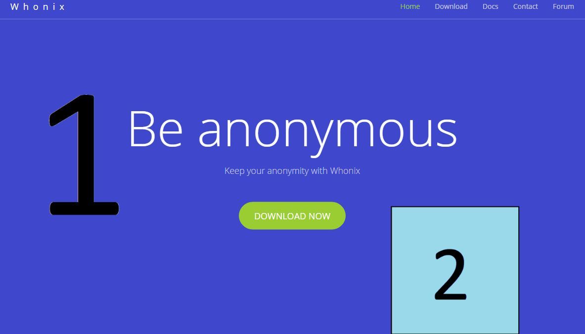
I see. So, which of these sketches would fill that role best?
1.)
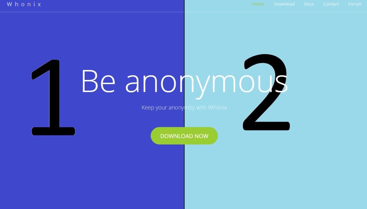
2.)
Have a nice day,
Ego
That’s both better. 1) is better than 2). But if doable, it should not take the whole background at all. More like the https://anonymous-proxy-servers.net/ page. If I had to describe their website, paint it, it would be like the following…
logo | page navigation
non-image (just background) | image | (white) border | image | non-image (just background)
more stuff
(Actually https://anonymous-proxy-servers.net/ their visible to the eye two images is technically just a single jpg.)
Their background “image” is just a simple gray/white. On top of that background are these images.
As for the middle section (without scrolling, first impression)… Here is a very rough sketch…
------------------------------
|     navigation             |
|                            |
|  be anonymous with Whonix  |
|                            |
|     [1]     |     [2]      |
| surveilance!|    fine :)   |
|                            |
|         download           |
------------------------------
These two images are the best ones I found in 15 minutes or so with unclear licensing just for demonstrational purposes:
[1] http://blog.ericgoldman.org/wp-content/uploads/2014/05/shutterstock_178782764.jpg
[2] Entspannter Geschäftsmann stockbild. Bild von konzepte - 2462101
There would be these emotional images. 1) you have a problem 2) with Whonix you are fine. These images would have a subtext.
surveillance! - Some catchy phrase like “you are naked!” “you are being monitored!”
fine - Whonix protects you.
Both, the two images and the two sub text are up for brain storming. Just the very basic concept.
That’s my idea. Can you imagine what I mean? And separate from that, does it make sense? If it doesn’t or if it’s not doable, then never mind.
Good day,
That would obviously be possible, however, a part of the aesthetic I was going for with this was having every part of the page strech out across the entire window. Could obviously add such white bars on the site though.
If you just want this white bars to be part of the header picture, that would be possible as well though.
That’s the case with the last version as well, as to avoid using any unnecessary scripts.
That obviously would be the least problem, the colors and numbers where just for demonstration purposes and should be viewed as placeholders until a desicion over the final pictures has been made.
For such a thing, asside from having proper licensing (CC0 would be best) we also need to keep in mind scaling (vertical is better since the two would share horizontal space) and resolution, as these two are things which can hardly be changed after the fact without loosing a lot of quality/streching everything until it looks like a mess. Also, such a picture would have to be matched with a fitting font and font color.
Keeping all that in mind, how about one of these (the blocky nature of the background is both a product of messy work and incompatible resolutions):
1.)
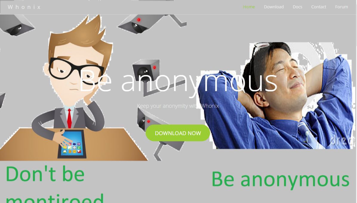
2.)
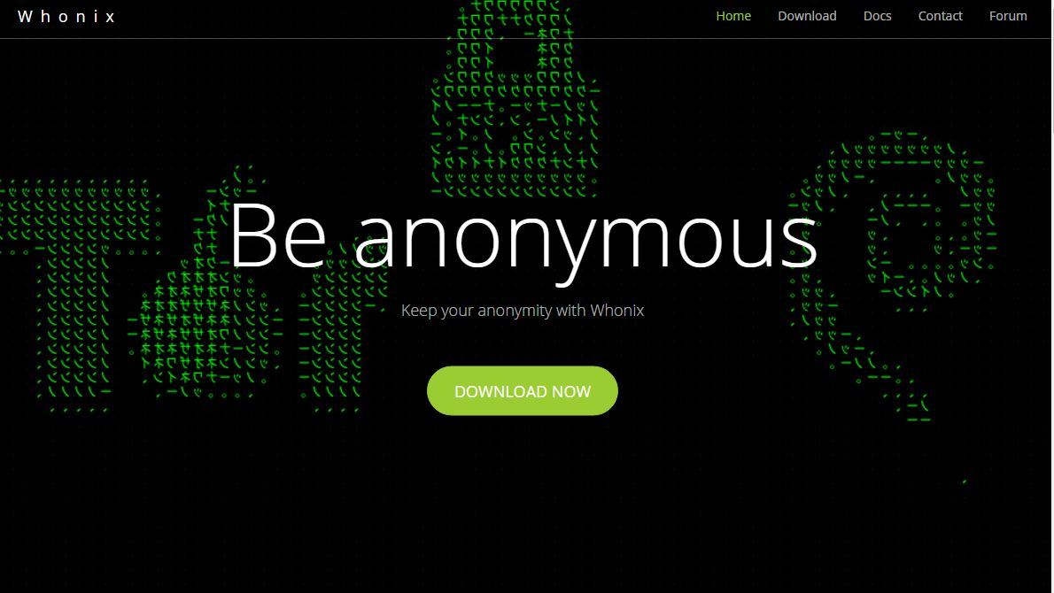
Though personally, I feel like maybe looking in a completley different direction might not be such a bad idea. Maybe subtlety would be the best aproach here, as this all black background is, at least for me, quite acceptable as well:

Or, maybe something like this, which would make it possible to keep a coherent style as well:
Whatever you choose is fine by me.
Have a nice day,
Ego