New Qubes Website! New Whonix Website?

I don’t think that would be useful for users. A user usually has in mind what goal to accomplish. That goal is not “torrc”, but “make it work” or “censorship circumvention”. Instructions on how to modify torrc to accomplish various goals is documented on various documentation pages.

We do have a support page already.
Free Support for Whonix

What specifically does the tails support page do better? Please create a new forum thread.

“if they have read and understood the documentation properly” - As sad as that is, it is an entirely unrealistic assumption. The redirection of support questions of generic upstream project questions to other upstreams was actually done by me to save time and space in Whonix forum.

Side menus waste a lot space and look awful on small screens.

There is a lot room for lots of opinions here. @bnvk, the new Qubes usability designer, once told me, that he isn’t offended by long scrolling pages.

Since we have the bright design and imprint now, we could blog about this. Here is the public preview. (Only visible to people following this very link.) (That link will break once posted.)

News - Whonix Forum

If you desire any changes to that blog post, I can do them. If you like to have your own blog account to make the edits/posts yourself, I would not mind about that either. If not deemed useful, we can also put the blog post on hold. (usability is not a democracy.)

Good day,

That post is fine by me, can go online like it is.

Have a nice day,

Ego

Good day,

Might be an idea worth considering, would however for the time being be a rather low priority.

Not sure whether that would make sense for Whonix. Reasonable for a host OS like Qubes which employs extensively modified tech, not so much for something like Whonix whose essential “architecture page” would contain of look at VBox/KVM/Qubes.

Has somewhat already been discussed in another thread about changing the way the documentation is sorted. Will thus be likely done once the “wiki question” is decided.

Not sure what wouldn’t overlap there, as Whonix doesn’t change anything about Tor…

Like @Patrick pointed out, this already exists.

We had that discussion quite a lot of times actually. I am caught somewhere inbetween here. Trimming the documentation down is the wrong approach in my eyes, yet I see why people might think of the documentation as overwhelming. Digging up an old concept, which wasn’t realisable with mediawiki might be a good idea now, namly the idea that there should be a “button based” system which allows to seperatly display advanced and beginners guides.

Have a nice day,

Ego

1 Like

Referencing threads that @Ego was talking about in his last post.

@Ego Thanks, Applied your changes and this is how it looks like:

I have done the changes in Photoshop, so not code yet. I can help you with the assets and specifications if you like (I’m not a coder), so feel free to invite me on GitHub (@elioqoshi)

Let’s finish the visual changes first then we can have a look at the copy & text, okay?
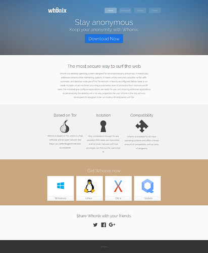
2 Likes

Good day,

Looks great.

Great, will invite you once I’m home. Most changes should be easily aplieable without the need to change code.

Sure.

Have a nice day,

Ego

1 Like

Done.

Gathering Feedback of new Whonix Homepage Draft

Do the colors have any significance? Will the Whonix brand include official colors?

Edit: Nevermind… Just saw posts on feedback thread.

hi,good job on the new site,and i’m liking elioqoshi image the best looks really neat and cool

Thanks guys!

@Ego maybe we can meet on IRC or another IM some time to work in real time?

Good day,

Sure, luckily I finished my entrance exame for university just now (literally 30 minutes ago), so I should have quite a bit of time in the near future.

Have a nice day,

Ego

Great! Hit me up on email: elioqoshI@ura.al when you want to work on it :slight_smile:

Good day,

So thanks to @elioqoshi, the site at egobits1.github.io is looking better with every day. The “lighter” font still needs to be added which will be done very “soonish”.

Adding to that, keeping this discussion in mind: splitting Whonix documentation into a short and long edition for better usability - #26 by torjunkie, I’ve added a small, Jekyll based Quick Start Guide to the site, which could be used to cover the essentials, you may look at it here: http://egobits1.github.io/wiki/ Does also somewhat play into this: mediawiki replacement - #8 by Patrick

Both pictures and text are placeholders, obviously. For a simple introduction and to cover the most important aspects of Whonix such a design should suffice in my opinion.

Furthermore, I’m currently working on the translation solution for Jekyll. Should be presentable in the near future as well.

Have a nice day,

Ego

1 Like

I like it.

As for the Quick Start Guide, do you suggest to introduce a new sidebar that is visible on all Quick Start Guide sub pages or even the whole wiki?

Actually, the original reason to move from the default mediawiki skin to mediawiki skin strapping was to get rid of the mediawiki sidebar.

I still think those sidebars are wasting a lot space and are problematic especially on mobile devices. Unless I am wrong on that usability experience wise, I think these should be avoided.

Good day,

I can see where you are coming from and am able to agree on the space aspect, however the alternative would be to force users to click through dozens of sites before finding what they need. Was somewhat inspired by this: Redirecting…

Maybe a drop-down menu or a which may be called when needed could be a solution here.

Have a nice day,

Ego

I think I might understand where you are coming from and I guess you have a valid point.

Assumption: When users click the quick start guide they may wish to click through it page by page.

Now, when we had a quickstart documentation overview (similar to our current one, but much, much smaller)… People would click a page, read it. And then be stranded. Bad. They would have to use their browser’s back button to click the next page. This may not be good UX. With a sidebar, this might be better. Impossible for me to answer, I hope there is a clear UX designer answer somewhere.

Does that nail it?


What I find interesting is the backwards / forwards button feature of the Tails documentation. (example)

←System requirements | Features and included software→

It’s at the top and button of each and every of their documentation pages. I dunno if it is great at the top, but at the bottom I guess it is great. Happy to be corrected.

Good day,

If you look at the current draft, you may notice that I already included “Next >” and “< Back” buttons. The idea of that was, like you suggested, to allow a constant stream of information, letting users read the most important things in one go.

So maybe keeping these buttons, but replacing the bar with a drop-down menu may be a solution…

Have a nice day,

Ego

Hey guys, I’m catching up on this just now. I did some research on this and am still doing so.

First thoughts, this is a big no go:

I think Mozilla Developer Network does it really well here:

As you can see, it features a sidebar (which appear also on mobile). Mozilla has a great UX team and I believe they are doing their homework. This is some good material to use as a base.

I also like the getting started guide from Elementary OS. Very basic but perfect for people like me:

Maybe we can do both? I still believe we shouldn’t be scared of sidebars (better than hamburger menus definitely).
Also, the active section can be highlighted in the sidebar, like this:
http://zurb.com/patterntap/pattern/getting-most-out-footnote-0

Let’s discuss these and we can go on from there.

1 Like

Good day,

First of all, I have to say that I feel like, while the list used by Qubes on their documentation would be detrimental for something like a Quick-Start-Guide, I also feel that it does make at least some sense and serves a purpose when it comes to a “real/complete/long” documentation. It gives you the ability to quickly scan over every available article, to find what you need. It isn’t that pretty and shouldn’t be the default/first thing a user sees, but as an optional addition to make a wiki more accessible, gets the job done. What we actually use as the front page for our documentation currently (Whonix ™ Documentation), should probably not be the first thing a newcomer sees/reads, but shouldn’t be removed for that reason alone.

Now, the Mozilla approach is interesting. Just like myself, with the Quick-Start-Guide, they move the bar with the main topic below the text, when in “mobile mode”. Works and preserves screen-estate.

The implementation Elementary used looks good as well. Making subtopics in a site “clickable” to link to them directly is a nice way of keeping a long page manageable. A combination, like you suggest would definitely have benefits. Making “Isolation”, “Safety”, etc on the first page, for example, clickable makes the whole thing appear more rounded.

I can agree that “hamburger menus” should be avoided, as they’d just make looking for a certain topic even more tedious, than such a task already is.

Now, I’d love using a side-bar like “zurb”, blending in and out once someone hovers over it with a curser. This though seems to be only possible with JS, according to my research. Now, as for making the current page highlighted, that will be implemented by me. Shouldn’t be to hard. Either by changing the color of the current topic or using pictures instead of text. Should have gotten that idea myself…

Have a nice day,

Ego

1 Like